Tools
  • Figma
  • Maze
  • Optimal Workshop
Team
UX Designer:
Sabrina Saffer
Duration
2 weeks
Field
UX Design
Problem
Interviews revealed that people go to oddities shops to explore yet people typically shop online with intention.
Solution
I was able to bridge this gap by establishing multiple navigation paths. The user can choose to shop in a purposeful or explorative manner.purposefully or in an explorative manner.
I created multiple navigation routes to enable the user to choose their own adventure.
My Design Process
1
Research
2
Information Architecture
4
Prototype
5
Usability Testing
6
Learnings/ Next Steps
Research
Affinity Mapping
I interviewed 6 people within my target demographic to gain insights on what users were looking for both when shopping online and when visiting an oddities store.
Questions
1. When do you shop online versus in person?
2. Have you ever been to any oddities stores before such as Evolution in NYC?
3. What inspired you to enter the store? Did you enter on impulse or plan on entering?
4. Would you go to an oddities store again? Why?
What appealed/ didn’t appeal to you about that store/ those stores?
5. Would you purchase something from an oddities store? Why?
6. Do you remember how you approached your store experience? Did anything in particular catch your eye?
7. Do you enjoy going to museums? What do you like/ dislike about them?
8. Do you have any collections or have you? What? If so, why?
9. What was your favorite thing that you’ve ever collected?
10. Do you think that you would look at an oddities store online?
"You never know what you are going to find when you walk into an oddities store. It's an adventure."
- Anonymous
Competitor Analysis
I compared 4 leading oddities websites to determine the most important features to include.
Competitors
  • Evolutions
  • Creel and Gow
  • Our As Oddities
  • Obscura Antiques and Oddities
Comparator Analysis
When I was searching for an idea for my explorative option, I found a Buzzfeed article that was a goldmine! I discovered MuscleWiki, which allows users to hover over a muscle and have it highlighted in red. Furthermore, when they click on the muscle, they are directed to a description page. This concept inspired me and I decided to incorporate it into my project.
Persona: Ben
I wanted to form a deeper understanding of my users' goals, needs, experiences, and behaviors. So, I created a persona. Meet Ben. Ben was based on user interviews and research. As I gathered more data, I updated his story. I used Ben whenever I wanted to step out of myself and reconsider my initial ideas.
Problem Statement
Ben wants to be able to explore virtually so that he can browse obscura from the comfort of his home.

How Might We...
Enable the user to select and explorative or purposeful navigation route.
Pain Points
  • Ben wants to explore a shop without leaving his home but can't find an opportunity to do so
  • Ben doesn't know what he is looking for but is hoping to find a great gift anyway.
Who Are We?
Borgin & Burkes is an oddities store located on the Lower East Side in Manhattan.

The store seems to contain the entire world and some things beyond it.

It has been in the family for generations but it has become increasingly difficult to make a profit without an online presence. So the current owners hired me to create their website.
Information Architecture
User Flow
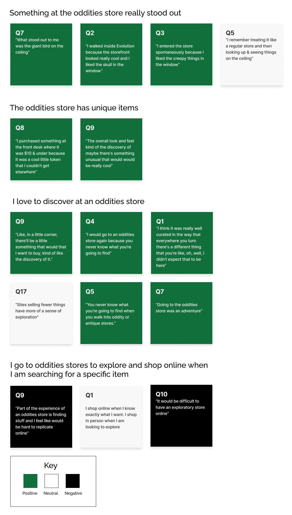
I wanted to create a user flow based on exploration. People mentioned hidden objects and items in obscure places. One of my interviewees, for example, was fixated on products on ceilings. But I also wanted the site to be easy to navigate. I decided to offer both options.

To account for this, I implemented a system that allows the user to choose between two primary routes. The "discovery" path offers the option to explore and search for items, while the "select a category" path is more standard, allowing users to easily find what they are looking for.
Lo-Fi Discovery Flow
1. Explore
The user can click explore if they are looking to discover rather than find a particular item.
2. View Shelf
The user can view a full site collection on a shelf.
3. Hover State
An item has a gold hover state. If an item is clicked, the user will see a description.
Navigation Flow
To ensure that the site’s information architecture was aligned with user expectations, I had 6 remote card sorting sessions using Figjam. My goal was to find smaller, intuitive groupings for the existing 54 products.The results would enable me to group and label the website information in a way that makes the most sense to my target audience.
Open Card Sort
I was beginning a new design so I began with a generative test to determine the most intuitive categories for my inventory. After analyzing the results, I chose the categories for my closed card sort.
Closed Card Sort
I preformed a closed card sort to evaluate the categories' effectiveness and clarity. I discovered that many cards fit into many categories so rather than putting my inventory exclusively in one category, I enabled overlapping categories. That way the user could move freely through the content.
Lo-Fi Navigation Flow
1. Navigation
Select category and subcategory from navigation bar. Or use search tool.
2. Product cards
Hover over product card to view details. Click card to see full product page and add to cart.
3. Product Page
View multiple product photos, description, and add to cart.
Lo-Fi Checkout Flow
2. Checkout should be fun!
One location offered in the form fields is "wizarding world," however to make the experience easier for the user, the United States is selected as the default location.
3. Subscription List
"Subscribe to Borgin & Burkes e-mails and new offers and maybe even an acceptance letter to Hogwarts. You can unsubscribe at any time but quitters don't get sorted into Slytherin."
Prototype
Video
View Ben's journey as he purchases a Christmas gift for his girlfriend
Prototype
Usability Testing
Maze Testing
To evaluate the navigation process, I relied on 6 usability tests prompting the participant to locate an item on the website. This allowed me to gain a deeper understanding through combining qualitative and quantitative information. Five out of six users’ instincts was to click the navigation bar to locate the product but unfortunately it wasn’t functioning properly. I was able to resolve the issue that I had with my nav bar and there was major improvement in my second round of usability testing.

13% or 1 out of 8 participants couldn’t find the “bones” subcategory in the navigation bar.

This surprised me because the main category is “bones and fossils.” I need to do more testing to determine the problem and adapt accordingly.
Learnings/ Next Steps
Learnings
  • Interactive component/ variant comprehension in Figma
  • Autolayout comprehension
  • Information architecture through card sorting
  • Checkout flow familiarity
Next Steps
  • Finish checkout flow
  • Create a Borgin and Burkes shop in real life. I had so much fun creating this project!
  • Further testing information architecture to determine the cause of confusion